A Guide to Creating Accessible and Meaningful Web Content
In the world of web development, accessibility has become a crucial factor in designing and building websites. Accessibility ensures that everyone, regardless of their abilities, can access and use a website without any barriers. Semantic HTML is one of the most essential tools in creating an accessible website.
Semantic HTML is the foundation of accessible web content. It provides a clear and structured markup that allows web browsers and assistive technologies to understand the purpose and meaning of each element on a web page. However, even with semantic HTML, there may be instances where additional information is necessary to provide full accessibility. This is where ARIA or Accessible Rich Internet Applications comes in.
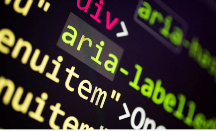
ARIA is a set of attributes that can be added to HTML elements to provide additional semantic information about their purpose and behavior. While semantic HTML provides a standard way to define the structure of a web page, ARIA provides a way to define the behavior of interactive elements on that page.
For example, consider a button element on a web page. Semantic HTML defines the button as an interactive element that can trigger an action when clicked. However, ARIA can be used to provide additional information about the button’s purpose, such as whether it opens a dialog or submits a form. This information is critical for people who use assistive technologies, such as screen readers, as it helps them understand how the element should be used and what it does.
ARIA also provides a way to define custom roles, states, and properties for elements that do not have a predefined role in HTML. This is particularly useful for dynamic web applications that use JavaScript and Ajax to create interactive user interfaces. By using ARIA, developers can create custom roles for complex user interface elements, such as menus or tabbed interfaces, that are not covered by standard HTML.
It’s important to note that ARIA should be used judiciously and only when necessary.
Here is a list of all ARIA attributes as of September 2021:
aria-activedescendant
aria-atomic
aria-autocomplete
aria-busy
aria-checked
aria-colcount
aria-colindex
aria-colspan
aria-controls
aria-current
aria-describedby
aria-details
aria-disabled
aria-dropeffect
aria-errormessage
aria-expanded
aria-flowto
aria-grabbed
aria-haspopup
aria-hidden
aria-invalid
aria-keyshortcuts
aria-label
aria-labelledby
aria-level
aria-live
aria-modal
aria-multiline
aria-multiselectable
aria-orientation
aria-owns
aria-placeholder
aria-posinset
aria-pressed
aria-readonly
aria-relevant
aria-required
aria-roledescription
aria-rowcount
aria-rowindex
aria-rowspan
aria-selected
aria-setsize
aria-sort
aria-valuemax
aria-valuemin
aria-valuenow
aria-valuetext
Each ARIA attribute serves a specific purpose in providing additional information to assistive technologies for improved accessibility. It’s important to use them correctly and in conjunction with semantic HTML to ensure that web content is truly accessible and usable for everyone.
Here are some examples of ARIA attributes:
aria-label: Use this attribute to provide a label for an interactive element when a visible label is not present on the page. For example, if you have an icon that represents a search function, you can use aria-label to provide a text label that will be read by a screen reader.
aria-hidden: Use this attribute to hide an element from screen readers. For example, if you have a decorative image that does not provide any meaningful information, you can use aria-hidden=”true” to hide it from screen readers and prevent it from being read aloud.
aria-describedby: Use this attribute to provide a description of an element, such as a form control. For example, you can use aria-describedby to provide a description of how to fill out a form field or to provide additional instructions for using a particular feature.
aria-disabled: Use this attribute to indicate whether an interactive element is currently disabled or not. For example, if you have a button that is currently disabled, you can use aria-disabled=”true” to indicate that it cannot be clicked.
aria-live: Use this attribute to indicate that an element should be announced by a screen reader as soon as it changes. For example, if you have a chat application where new messages appear dynamically, you can use aria-live to ensure that new messages are read aloud by a screen reader as soon as they appear.
aria-expanded: Use this attribute to indicate whether an expandable element, such as a dropdown menu or accordion, is currently expanded or collapsed. For example, you can use aria-expanded=”true” to indicate that a dropdown menu is currently open and visible to the user.
aria-selected: Use this attribute to indicate which option is currently selected in a group of options, such as a list or radio button group. For example, you can use aria-selected=”true” to indicate which item in a list is currently selected.
aria-haspopup: Use this attribute to indicate that an element has a popup or dialog associated with it, such as a dropdown menu or modal window. For example, you can use aria-haspopup=”true” to indicate that clicking on a button will open a dropdown menu.
aria-valuemin/aria-valuemax/aria-valuenow: Use these attributes to indicate the minimum, maximum, and current values of a range widget, such as a slider or progress bar. For example, you can use aria-valuemin=”0″, aria-valuemax=”100″, and aria-valuenow=”50″ to indicate that a progress bar is currently halfway full.
aria-labelledby: Use this attribute to associate an element with a visible label on the page, such as a form field that is labeled with text. For example, you can use aria-labelledby to associate a form field with a visible label elsewhere on the page.
aria-controls: Use this attribute to indicate that an element is controlled by another element, such as a tab panel that is controlled by a set of tabs. For example, you can use aria-controls to indicate that a set of tabs controls a corresponding set of tab panels.
ARIA is a powerful tool for improving the accessibility of web content. By providing additional semantic information about interactive elements, ARIA enables assistive technologies to understand how they should behave and what they do. This, in turn, makes web content more accessible and usable for people with disabilities.
For more information on why web accessibility is important in general, you can check out my previous blog post here.
So, What Comes Next?
For further information on how to make your product accessible to your audience, contact our experience design experts, check out our Accessibility IQ for your website, download our guide Digitally Accessible Experiences: Why It Matters and How to Create Them, read more from our UX for Accessible Design series.
Stay in touch and follow my next post: HTML Forms Using Semantic HTML : Building Accessible Websites with Native HTML Part 3 of 5.


Leave A Comment