Summary
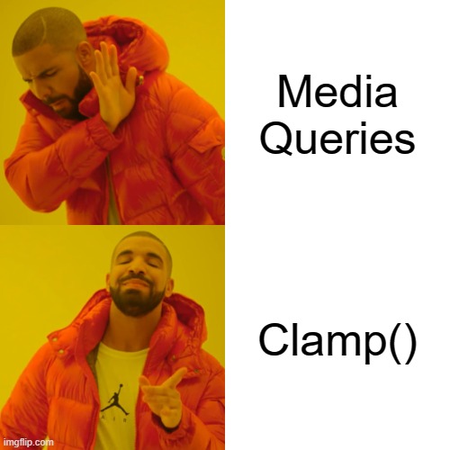
In this article we will explore a cool CSS feature called clamp() which allows screen size to dictate what the font size should be instead of multiple media queries. We’ll also consider some factors such as browser support, accessibility concerns and the overall effectiveness of feature.
Responsive Typography
Responsive typography is adding a bunch of media queries to change font size at different screen sizes, most common approach, works well when the UI requirements are to support standard screen sizes. There are concerns about readability and maintainability as the codebase grows.
Fluid Typography
In this approach we try to dynamically set the font size value depending on the screen size using CSS clamp(), this will allow for a smoother scaling of text across various devices.
CSS Clamp()
clamp() takes 3 values, a minimum, a preferred and a maximum value.
h1 {
font-size: clamp([minFontSize], [preferredFontSize], [maxFontSize]);
}
Minimum Value: the minimum font size the text element can scale down to regardless of screen size.
Preferred Value: the ideal font size we’d like to be applied if possible based on the screen size.
Maximum Value: the maximum font size the text element can scale up to regardless of screen size.
The min and max values are usually the mobile and desktop font sizes respectively, for this example we will say our min font size is 24px and max font size is 40px for a heading tag, pixel values are not accessible so we will convert them to REM’s.
h1 {
font-size: clamp(1.5rem, [preferredFontSize], 2.5rem);
}
The preferred value could be based of the viewport width like 2vw, however this is a huge accessibility issue, viewport units wont allow users to increase size of text by zooming in or out. Adding a relative unit we can ensure the font size still adjusts based on the zoomed screen size.
h1 {
font-size: clamp(1.5rem, 3vw + 1rem, 2.5rem);
}
Calculating the preferred value
3vw seems random and at best a guess value. Let’s use a bit of math to derive a preferred value.
YES I said mathematics!
Visualize the min and max font sizes as two points on the X and Y axis of a graph, we need to find the slope and intersection point of the two values on the Y axis.
We will look at the formula below and never ask about how it is derived…lmao!
slope = (maxFontSize – minFontSize) / (maxWidth – minWidth).
yAxisIntersection = -minWidth * slope + minFontSize.
The maxWidth and minWidth reference to the screen sizes the preferred font size value should be based off.
I have gone ahead and made a nifty SASS function called clampBuilder() that can perform this magical math calculation, feel free to add this to your mixins.
@function clampBuilder($minFontSize, $maxFontSize, $minWidth, $maxWidth)
{
$slope: (($maxFontSize – $minFontSize) / ($maxWidth – $minWidth));
$yAxis: -$minWidth * $slope + $minFontSize;
@return unquote(
‘clamp(‘ + $minFontSize + ‘rem, (‘ + $yAxis + ‘rem + ‘ + ($slope * 1000) + ‘vw), ‘ + $maxFontSize + ‘rem)’
);
}
Using this we can set the font size to be a dynamic value, in this specific example below the function will generate a font size of clamp(2rem, 1.0909rem + 3.8788vw, 4rem).
h1 {
font-size: 1.5rem // fallback
font-size: clampBuilder(1.5,2.5,360,1200);
}
A working example with clamp() applied to some headings and paragraph, go ahead and try resize!
Notes and Concerns
Browser support for clamp() is above 90% – https://caniuse.com/?search=clamp().
If the user changes the root font size or needs to zoom a lot there may still be accessibility concerns.
clamp() can also be used to define fluid dimensions.
Best works for elements with large difference in minimum and maximum font size values.


Leave A Comment